
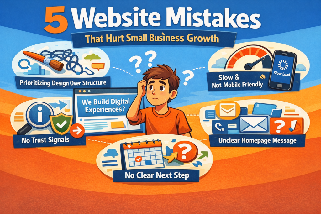
5 Website Mistakes That Hurt Small Business Growth
Over time, I’ve noticed something interesting while reviewing small business websites. Most of them don’t struggle because of budget, design tools, or platforms. Usually it’s because of a few small issues that seem harmless at first but quietly affect trust, visibility, and conversions.
These patterns show up so often that I can often predict them before even opening the site properly. And honestly, many owners don’t realize they’re making these website mistakes until results start slowing down or inquiries feel inconsistent.
This isn’t theory or recycled advice. It’s based on what I repeatedly see when looking at real business websites — especially ones that look decent on the surface but don’t perform as expected once you spend a few minutes navigating them.
Mistake 1: Unclear Messaging on the Homepage
The most common of all website mistakes is also the simplest: visitors can’t quickly tell what the business actually does.
A lot of homepages open with vague lines like:
- “We Build Digital Experiences”
- “Solutions for Modern Brands”
- “Helping Businesses Grow”
They sound nice, but they don’t really say anything specific.
When someone lands on a site, they’re not analyzing wording. They’re trying to figure out, usually within seconds, whether they’re in the right place or not.
How to avoid it:
Write a headline that explains:
- what you offer
- who it’s for
- what problem it solves
Clear beats clever almost every time. I’ve rarely seen the opposite.
Mistake 2: Prioritizing Design Over Structure
Another pattern I see in website mistakes is when a site looks modern but feels confusing to use.
Visitors scroll, click, go back, scroll again… and then leave. Not because the site is ugly — but because it doesn’t guide them anywhere.
Structure matters more than style. A strong website usually walks visitors through a quiet sequence:
- understanding what you do
- seeing proof or examples
- learning how it works
- deciding whether to contact you
If that path isn’t clear, even a visually impressive site can underperform. I’ve seen this happen more times than I expected, honestly.
How to avoid it:
Plan the information flow first. Design comes after that, not before.
Mistake 3: Missing Trust Signals
Trust is one of the most underestimated factors behind website performance.
Many small business sites unintentionally weaken credibility by leaving out basic details like:
- real contact information
- service clarity
- examples of work
- consistent branding
This type of website mistakes rarely looks dramatic. Nothing crashes. Nothing breaks. But something feels slightly off — and visitors sense it.
People usually don’t say “I didn’t trust it.” They just leave quietly.
How to avoid it:
Add simple, real signals:
- real examples
- straightforward wording
- visible contact info
- accurate descriptions
Trust isn’t built through big claims. It builds through small confirmations.
Mistake 4: Slow Speed or Poor Mobile Experience
This is becoming more noticeable every year.
A site might work fine on desktop but feel slow, cramped, or awkward on mobile. Since most visitors browse on phones now, performance problems quickly turn into engagement problems.
Slow loading is one of the more damaging website mistakes because it affects both user perception and search visibility at the same time.
Even a small delay can reduce:
- time on site
- pages viewed
- serious inquiries
How to avoid it:
Focus on fundamentals:
- compressed images
- lightweight layouts
- clean templates
- reliable hosting
Speed isn’t just technical performance. It’s part of how professional your business feels.
Mistake 5: No Clear Next Step
Surprisingly, many business websites explain everything but never actually tell visitors what to do next.
They describe services. They show information. Sometimes they even explain their process well. But then… nothing. No direction.
This is one of the quieter website mistakes, because visually the site looks complete. But from a visitor’s perspective, uncertainty often leads to hesitation, and hesitation usually leads to leaving.
How to avoid it:
Make the next step obvious:
- contact you
- request details
- book a call
- view services
It doesn’t need aggressive buttons or pushy language. Just clarity.
Quick Comparison: Strong vs Weak Website Foundations
Element | Strong Website | Weak Website |
Messaging | Clear and specific | Vague |
Navigation | Logical flow | Scattered |
Trust | Visible signals | Minimal proof |
Speed | Fast and responsive | Slow or heavy |
Direction | Clear next step | Unclear path |
Avoiding even a few of these website mistakes can noticeably improve performance — sometimes without redesigning anything.
Why These Mistakes Happen So Often
Most small businesses don’t intentionally create weak websites. Usually it happens because:
- the site was rushed
- it was built without planning
- appearance was prioritized
- no one reviewed it from a visitor’s perspective
Websites often get treated as a one-time task instead of something that should be refined occasionally. The businesses that grow more steadily online almost always revisit and improve their sites gradually.
Final Thoughts
A website doesn’t need to be complicated to be effective. But it does need to avoid the most common website mistakes that quietly reduce clarity, trust, and conversions.
In my experience, small improvements usually outperform big redesigns. Most websites don’t actually need rebuilding — they need adjusting.
If your site feels like it should be doing better than it is, chances are one of these issues is somewhere in the background.
Signal to Watch Going Forward
If you’re reviewing your website or thinking about improving it, pay attention to where visitors hesitate. Confusion is often a stronger signal than low traffic.
- Follow Arsh_Webs on Instagram for practical insights on website structure, usability, and real user behavior patterns.
- Bookmark Arshwebs.com if you prefer experience-based reads over surface-level advice.
- Check back occasionally as expectations around speed, clarity, and trust continue evolving through 2026.
Most strong websites aren’t built in one go. They improve through small, consistent refinements.
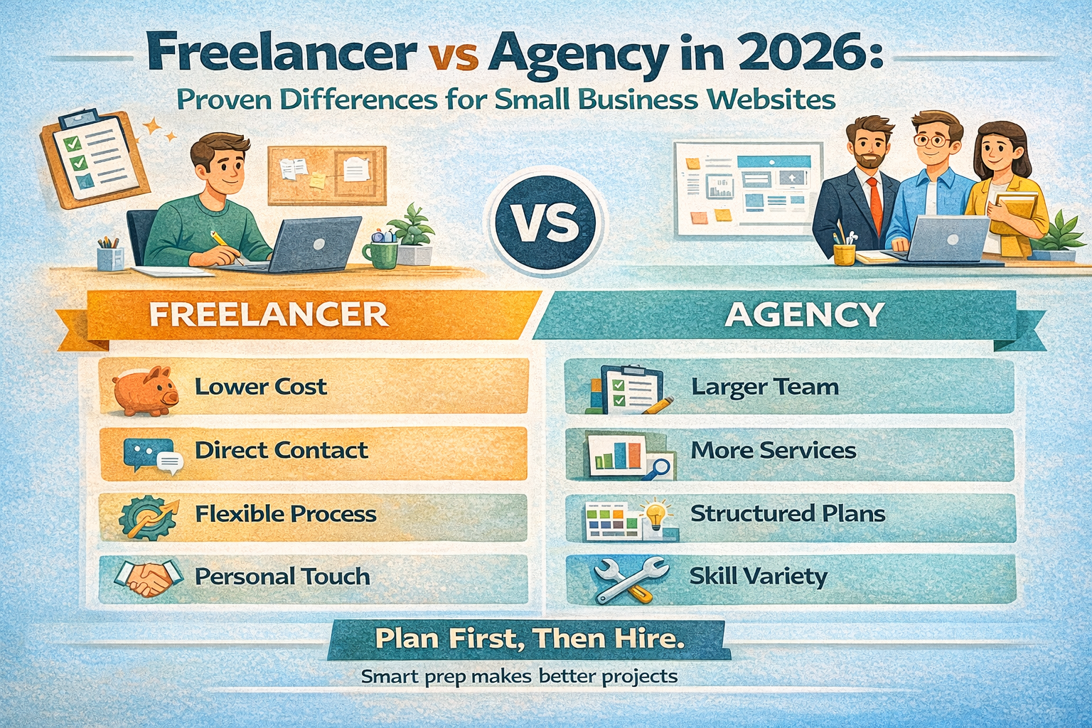
Freelancer vs Agency in 2026: Proven Differences for Small Business Websites
Freelancer vs Agency in 2026: Proven Differences for Small Business Websites At some point, most business owners who plan a
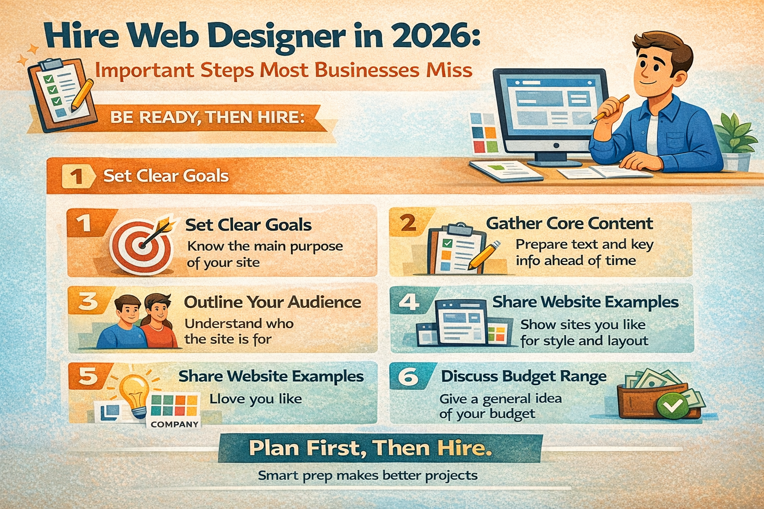
Hire Web Designer in 2026: Important Steps Most Businesses Miss
Hire Web Designer in 2026: Important Steps Most Businesses Miss I’ve noticed something over the years when talking with business